
How do I tell the truth with data?
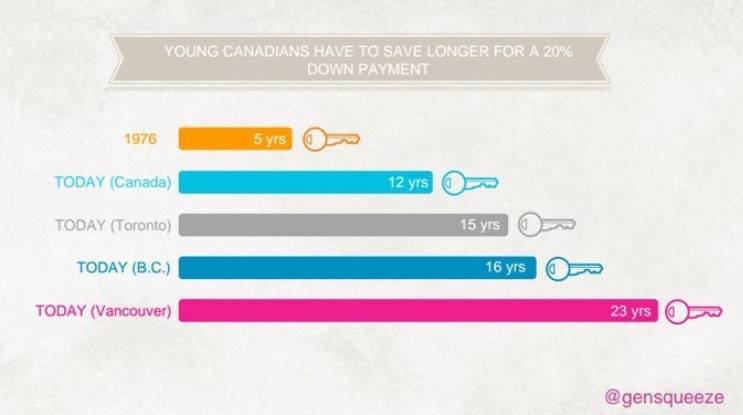
The chart above was posted on Facebook this week and received a number of comments that expressed dismay and shock at the plight of the young Canadian home buyer. That is the initial reaction to this chart. Something along the lines of, “Wow! These poor kids have it rough. They won’t be able to buy a house until they’re 50!”
Most viewers of the chart will share it, remember it, and talk about it as though it were indisputable fact.
Take a closer look, though, and you realize the chart is inherently flawed. Flawed to such a degree that we shouldn’t trust it any further than we can throw it (and since it’s digital and you can’t physically pick it up, you can’t really throw it at all…you get my point).
So why shouldn’t we trust the chart? Why should we ask more questions and demand more detail? Answering this question will give some pretty good tips on how to design data not only so it’s simple to read, but also so it still tells the truth.
1. Remove clutter…but only the clutter. We talk a lot about removing clutter and visual ‘load’ from our charts. Clutter includes plot lines, tick marks, legends that sit next to the chart, those sorts of things. This chart removes too much. It’s hard to tell what “young” means, for example, if we don’t know the baseline starting point for those bars. The bottom pink bar is labelled “23 years.” Twenty-three years from what age? The second omission is on the top bar. What does the 1976 bar refer to? All of Canada? One of the provinces? One of the cities? Without these references, we can’t safely draw an accurate conclusion.
2. Tell us why you’re comparing the data points you are comparing. Why is the top bar pulled from 1976? Why not 1982? Why is B.C. the only province highlighted? Why were Vancouver and Toronto, Canada’s most expensive cities by far, chosen to prove an assertion about all young Canadians? Do young Canadians in Newfoundland, Alberta and Manitoba experience the same? If 1976 refers to all of Canada, then a 7-year difference between then and now, 40 years later, doesn’t seem that unreasonable.
3. Use colour to tell the truth, not to misdirect. The bright pink bar at the bottom demands your eye’s attention. It’s the Vancouver line. The Vancouver line should shock no one. I can’t afford a house in Vancouver and I’m a 47-year-old business owner with a nice home now. The colours are misleading. Why would blue be chosen for both B.C. and Canada, and Toronto is in grey? When you add colour to your chart, it should be showing the audience the story. Colour is an important attribute for chart design. We see changes in colour before we know we’re seeing them. In this case, though, I suspect the colour is used to misdirect.
A simple, clean chart will tell your story in a way that a table and/or bullet points can’t. Remove clutter, use colour, and use comparable data points to tell your story. Just be sure you’re not inadvertently ignoring the truth.
Share this
- By Ken Pillipow
- Categories: Blog
Search Posts
Latest Posts
Categories
Categories
Archives
Archives
- March 2025
- January 2024
- June 2023
- May 2023
- April 2023
- October 2022
- September 2022
- March 2022
- October 2021
- April 2021
- April 2020
- February 2020
- November 2019
- October 2019
- August 2019
- March 2019
- October 2018
- May 2018
- June 2017
- May 2017
- April 2017
- February 2017
- September 2015
- August 2014
- June 2014
- April 2014
- March 2014
- February 2014
- January 2014
- November 2013
- July 2013
- April 2013
- March 2013
- February 2013
- January 2013